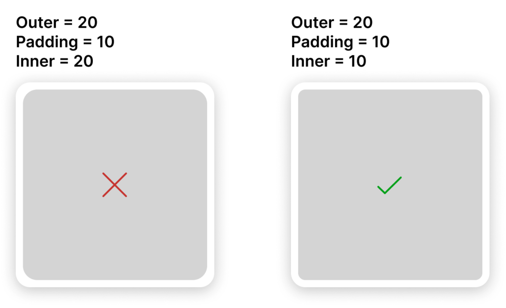
When designing a user interface with rounded corners you will likey run into situtation where you have nested rounded corners. It could be a button in a card or input, or a box inside a modal.
What should the inner radius be? The easy way out is to just use the same radius, but it doesn’t look good and your design will probably feel a bit ‘off’.
The mathematic rule
There is a common rule that is used when nesting corners where you take the outer radius value, subtract any inner padding, and that will give you the radius that should be used for the inner corner.
innerRadius = outerRadius - padding;
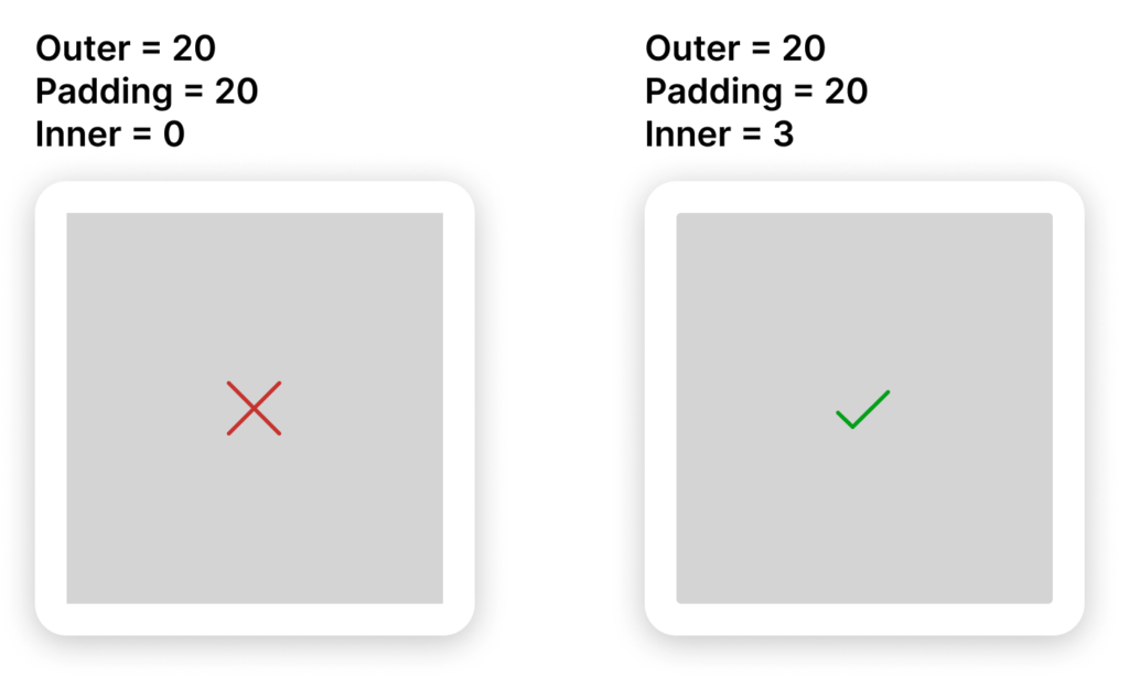
But there’s an exception
What happens if the inner radius calculates to be zero or less? Should you use square corners? If your design utilises a lot of rounded corners then the best approach is to create an exception from this rule. Apply a small radius of 2 to 4 pixels in order to take the harshness off the hard corners.

At very small sizes, the weirdness of not being mathematically correct isn’t perceiveable. The design generally looks better with the corners knocked off slightly.


You must be logged in to post a comment.