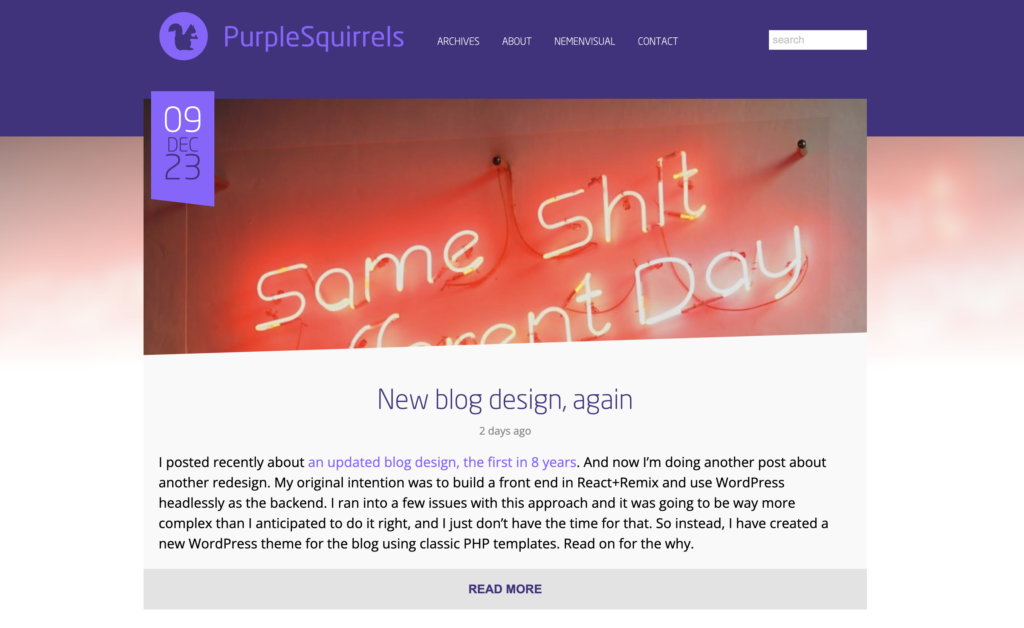
PurpleSquirrels has gone responsive. I have just flicked the switch on the new PurpleSquirrels design. The new design – which I have been working on over the last few weeks – is now responsive which will make it much easier to read content on mobile devices as it adapts to smaller screens. I had been wanting to make the blog responsive for quite a while but just hadn’t been able to find the time. I contemplated adding it onto the existing design but I decided it would be more beneficial to redesign the whole blog to make it much simpler.
The previous design used a large ‘hero’ image for the first post on the home page. I have taken this idea and refined it in the new version. Now all posts get a large image on the home page and on single post pages.
Visitors using Chrome will notice the use of blurred images at the top of each page which make the blog header reflect the current post. The blurring has been done using CSS filters so no server side scripts are needed and no extra images are downloaded. Browsers that don’t support it will just see un-blurred images. I quite like the effect – blurred or not – of having every page take on it’s own personality depending on what post you are reading.
One thing I have been taking advantage of a lot lately is the use of the :before and :after pseudo elements to create non-rectangular shapes and so I wanted to include this technique in the redesign. All the angular elements such as the purple post date ribbon and the angular post image have been created using purely in CSS using pseudo elements and borders. No images required!
In fact the only images used in the blog template is the PurpleSquirrels logo (a long version and a short version). The logo is an SVG so it should appear nicely on all devices.
On the single post pages I have added next post and previous post buttons which stick to the sides of the screen. They appear as just arrows and slide out when you mouse over them. They have been created purely from CSS.
The final major change is the slide down header that appears once you scroll past the main header, this allows you to access the menu and home page without having to scroll back to the top.
I have also dropped support for IE8 and below – supporting older browsers severely restricts the use of new technologies and I believe holding on to the past just prevents the web from moving forward. If we keep supporting old browsers then where’s the incentive to upgrade, right?
I hope you like the new design. It gave me a chance to utilise some new techniques I’ve learnt, some of which I wouldn’t get a chance to use in client work.


You must be logged in to post a comment.