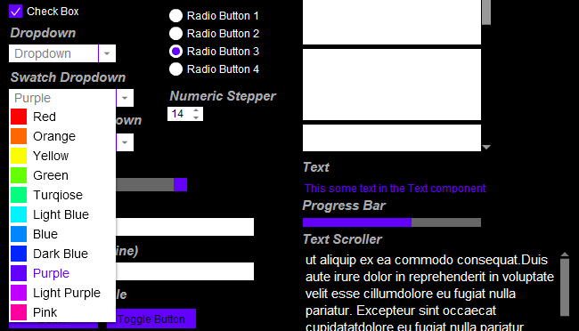
NiceComps is a set of ActionScript 3 UI components that I have been slowly working on over about the last six months. I got tired of the ugly built in components that come with Flash and I don’t particularly like the look of MinimalComps. I wanted UI components that looked nice and were easy to use so I set out to create my own. The design of NiceComps was inspired by the Windows Phone 7 UI and one unique feature I wanted to include was the ability to easily and dynamically change the colour of all components being used at once at runtime. Since I started them they have evolved quite a lot as I’ve used them in projects, and therefore they are still not 100% finished. But I have decided to release a ‘Beta’ version which you can try out. There is a demo below of all the components so far (I think it’s all). The code is quite messy at the moment but I plan to tidy it all up in the near future. And please let me know if you find any bugs. Currently the most stable components are the DisplayScroller, CheckBox, InputBox, Button and DropDown as these are the ones I use most. I’ve got a lot of optimising to do because there is quite a bit of duplicate and unused code.
To achieve global colour changing of all components at once I created a ComponentManager class which automatically listens for whenever a NiceComp component is added to the stage and keeps a reference of it. You can then set a property such as ‘accent’ on the ComponentManager and it will update every component on the stage! It does not however listen for the removal of a component which could throw some errors but I plan to add this in soon. Here is some sample code:
//Creates a ComponentManager and a CheckBox and then uses the ComponentManager to set the colour of the CheckBox
var compManager:ComponentManager = new ComponentManager(stage);

var checkbox:Checkbox = new Checkbox();
checkbox.label = "Check Box";

addChild(checkbox);

compManager.accent = 0xFF0000;
If you don’t want a component to be watched by the ComponentManager simply pass ‘false’ in to the constructor like so:
//Does the same as the above example, except this time the Checkbox will be ignored by the ComponentManager
var compManager:ComponentManager = new ComponentManager(stage);

var checkbox:Checkbox = new Checkbox(false);
checkbox.label = "Check Box";

addChild(checkbox);

compManager.accent = 0xFF0000;
Here is a list of the Components that are available so far:
- Button
- Checkbox
- Display Object Scroller
- Dropdown
- Horizontal Slider
- InputBox
- Line
- List
- Numeric Stepper
- Progress Bar
- Radio Button / Group
- Text
- Text Scroller
I’m not going to sit here and document everything about the components, they are pretty straight forward and most of the properties and methods are the same or similar to the built in components.
But one thing I should note is to set the width or height you must use boxWidth or boxHeight. In the future I plan to override the width and height properties but for now you’ll have to use boxWidth and boxHeight. I should also note that they require TweenLite which I have included in the zip file aswell.
Here is the source along with the source for the demo below:
And the demo:

