Update 2017/07/17: This post was published a long time ago and a lot has changed since then. Now that font rendering has vastly improved in Browsers Google Fonts is a great choice for web fonts!
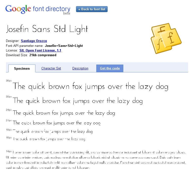
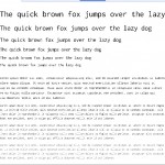
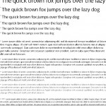
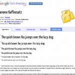
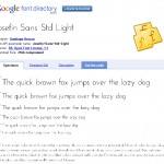
Recently Google has announced a new API which allows web designers to use custom fonts in their HTML/CSS websites. This API is great idea allowing designers to break away from the standard Arial/Courier/Times New Roman font families without resorting to images. After hearing about this announcement I headed over to the Google Font Directory to see what fonts were available. But I soon discovered that as good idea this API was, the fonts rendered like crap. The displayed with hard edges and no anti-aliasing, and when getting into smaller sized the text becomes unreadable. I tested the fonts in Firefox and Chrome and they both looked the same, so I can’t say how they look in other browsers. Have a look at the screen shots below to see for yourself (be sure to view them full size), or head over to the Google Font Directory .
As you can see in these images at smaller sizes some fonts are unreadable without anti-aliasing, so for now these custom fonts are probably only suitable for headings. But even then they still display with terrible hard edges.

You must be logged in to post a comment.